Absolut case shapes up
Adding features can lend a shape inherent distinctiveness, as Désirée Fields explains. R 1839/2021-5, The Absolut Company Aktiebolag, EUIPO, 3rd June 2022.
Key points
- Shapes are rarely found to be inherently distinctive
- Adding features to a shape, specifically elements of colour, can provide a perceived non‑distinctive shape with the requisite level of inherent distinctiveness
- While single‑colour marks are difficult to register, where shades and nuances of colour cover a significant and clearly defined part of the product, colour mark applications may be successful
The EUIPO’s Board of Appeal (BoA) overturned a decision of the Examination Division, which rejected an EU trade mark (EUTM) application for the shape of a vodka bottle.
The BoA was satisfied that the mark applied for, taken as a whole, departed sufficiently from the customs or norms of the sector concerned to be found distinctive and capable of designating origin.
Background
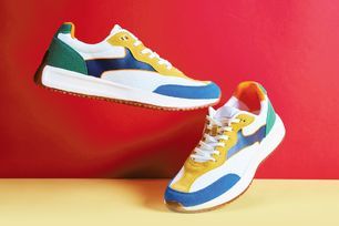
In September 2019, The Absolut Company Aktiebolag (TAC) filed a three‑dimensional EUTM application for a vodka bottle, consisting of a
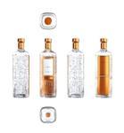
tall, rectangular, transparent bottle with copper‑coloured panels, a square‑shaped bottom, a conical bottle shoulder and a maze‑like surface structure.
The mark also featured a short neck with a copper‑coloured wrapper and copper‑coloured front label.
The EUIPO’s Examination Division rejected the application under Article 7(1)(b) of Regulation (EU) 2017/1001 (EUTMR), finding that it lacked distinctive character and that the elements of the mark applied for were “not outstanding or eye‑catching as to create an overall impression, which would depart significantly from the customs or norm on the corresponding market”.
TAC argued that the mark had distinctive character in the relevant market sector and supported this with evidence regarding the alcoholic beverage market and the vodka market specifically.
Nonetheless, the Examiner rejected the application, finding that the average consumer would perceive the packaging as a mere variation of a container. TAC appealed the decision to the BoA.
Memorable combination
TAC argued that just because the sector is characterised by a variety of product shapes, surface patterns and colours did not mean that its mark would be perceived as one of them.
In the vodka market, there exist a number of distinctive containers that stand out from the crowd and do not merely serve the functional purpose of carrying vodka inside, but also prompt the public to recognise the commercial origin of the product.
Here, TAC noted, a mark comparable to its own did not exist and the mark would be perceived by the relevant public as departing significantly from the norms and customs of the vodka sector, making the design elements peculiar to TAC and capable of indicating origin.
Common features
The BoA noted that the application was for a “shape mark” but that it was striking that the elements which had colour consisted of different shades and nuances, ranging from copper to brown or gold. This had to be taken into account in assessing absolute grounds.
Where a sign consists of a combination of elements, each of which on its own is devoid of distinctive character, it is still possible for the combined sign to be distinctive, the sign being greater than the sum of its parts.
The BoA considered the six features that TAC identified as distinctive, namely:
(i) the copper‑coloured bottle closure;
(ii) the rectangular body structure and other features (short neck, conical bottle shoulder, its general structure and proportions);
(iii) the surface design, consisting of a very striking, crystal‑like structure;
(iv) the design of the back of the bottle being entirely copper‑coloured;
(v) a front label consisting of a prominent frame in an unusual copper colour; and
(vi) copper‑coloured neck foil (neck wrapper).
In relation to (ii), the BoA found that these were not distinctive and “did not stand out” from other products in the alcoholic drinks market. In relation to (iii), the BoA commented that this was “complex and fanciful” but “not new, original, astonishing or outstanding”.
These features were decorative, not easily recollected and did not indicate trade origin.
However, the BoA held that the latter three elements listed (which related to the copper colouring) would “not go unnoticed by consumers”.
These elements were coloured in different shades or nuances, ranging from copper to brown to gold, and this colouring occupied a large part of the bottle.
The BoA noted the prominent white frame displaying different shades of the same colours on the front label of the bottle, and the copper‑coloured foil wrapper around its neck.
Unlike the body structure and surface decoration of the bottle, the colour elements of the mark departed significantly from the available forms and customs already on the market and had a “strong impact on the perception of the whole shape of the bottle”, enabling consumers to remember and recall the design of the back of the bottle.
Given its size and predominance, the BoA said the colour scheme would not be perceived by consumers as purely aesthetic decoration and would enable consumers to identify TAC as the producer of the goods.
The BoA stressed that, while a single colour was not normally in itself distinctive, TAC’s bottle displayed various nuances of colour that covered a significant part of its shape.
It concluded that the colour features of the mark performed a trade origin function and ruled that the overall representation of the combination of colour and bottle shape was registrable as an EUTM.
Instructive judgment
The judgment is instructive for businesses seeking to register product shapes and packaging, especially when launching a new product in a bottle or other packaging that has yet to acquire distinctiveness through use.
Adding features to a shape, specifically elements of colour, could lend an otherwise arguably non‑distinctive shape inherent distinctiveness.
Further, although a single colour is normally not distinctive, where shades cover a significant and clearly defined part of the product, an application for a colour mark could be successful.
Désirée Fields is a Legal Director at Pinsent Masons LLP
Gill Dennis, a Senior Practice Development Lawyer at Pinsent Masons, co-authored.
Click here to read the full issue.